

JAGUAR KA'AK MEZCAL SHOP
GUERRERO STYLE
Bold Flavours Wild Origins
BRAND IDENTITY & PACKAGING
A brand identity and packaging was created for Jaguar Ka’ak, a mezcal store in Downtown Vancouver inspired by the state of Guerrero, Mexico, where mezcal originates. Vancouver’s multicultural environment attracts people from around the world, yet many Mexican struggle to adapt and find a place that feels like home. To address this, we designed a brand that celebrates Mexican culture through vibrant colors, traditional patterns, and jaguar illustrations. A contemporary and modern style allows us to highlight unique cultural symbols throughout the design. The brand creates a meaningful experience for Mexicans by evoking a sense of home away from home, while also inviting non-Mexicans to learn about the rich culture and essence of Guerrero.
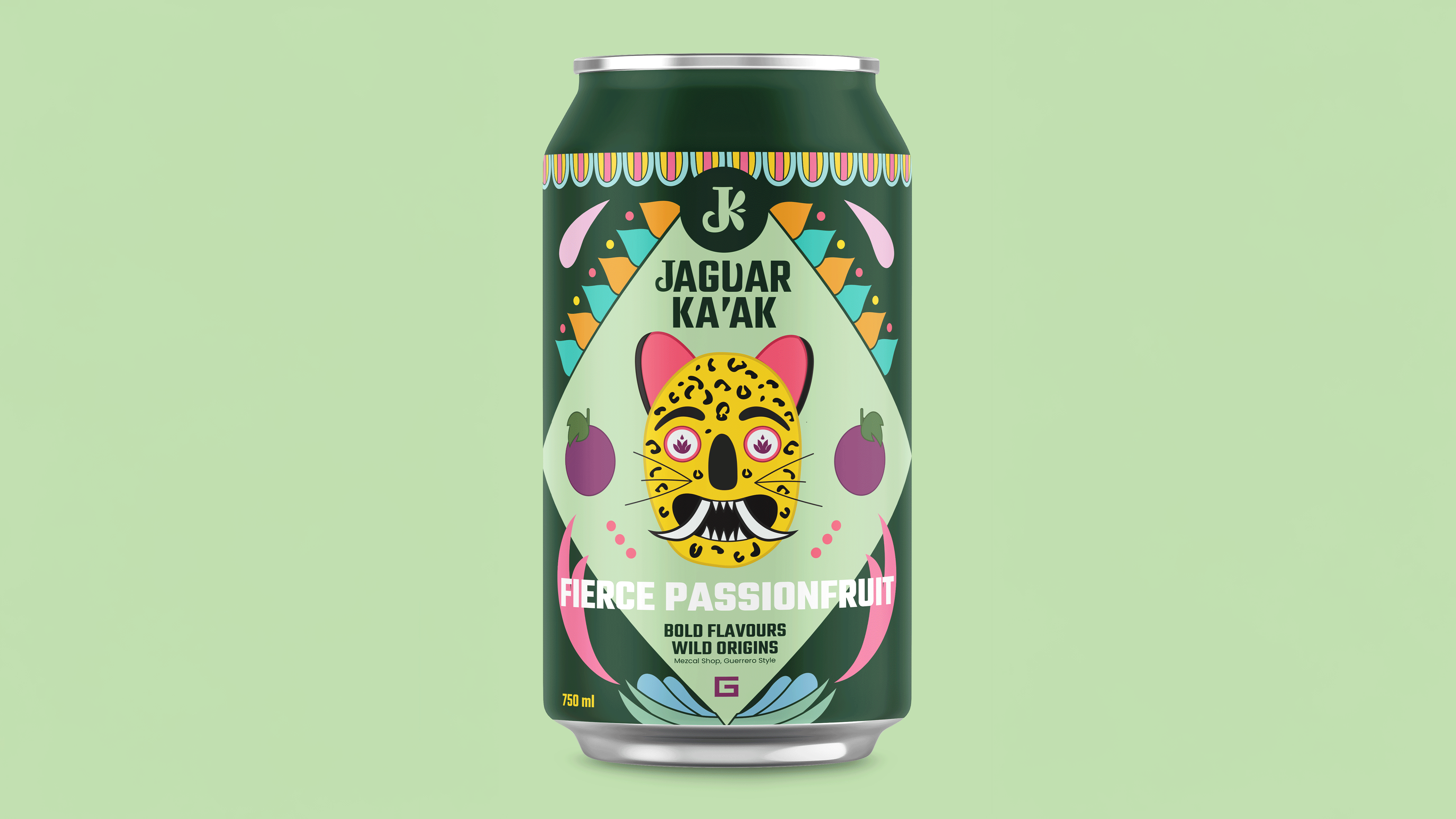


LOGO RATIONALE
The logo is mainly composed of a J which was modified with a jaguar tooth to make it more distinctive and not only use the original font. Also, the K was made from a pattern of a traditional Mexican garment that is commonly used in the towns of Guerrero, Mexico, which makes the logo symbolic by combining traditional motifs and the jaguar that represents strength, power, protection,
and cultural identity.
NAME AND TAGLINE RATIONALE
The name that was initially thought of was El Jaguar, but when modifying the logo, a word with a K was chosen so that it would have a better connection between the name and the logo. The name of the brand was defined as Jaguar Ka´ak, which means fire in Mayan, so this would make a better reference to Mexican culture and the personality of the jaguar, thus forming the voice of the brand. The tagline, which is Bold Flavours Wild Origins, is inspired by the personality of the jaguar and also by the different original flavors of Mexico, which invites people to get to know mezcal and Mexican culture.


